How to create a beautiful Instagram feed
I have a crush on Instagram.
Okay, I said it.
A couple of years ago I was told by a social media guru that Instagram was essential for my business. Fearing that it would keep me from my beloved world of design, I begrudgingly took her advice and dove head first into the new realm. Little did I know that it would become another catalyst for creativity.
But the way I approach it today is a far cry from when I began. Much like my blog has morphed into a lifestyle journal, our Instagram feed is more like a lifestyle magazine which keeps Designs by Alina and our followers happy.
Whether or not you are a brand, you don't have to be a professional photographer or have a crew behind you to create beautiful content. While it may seem daunting at first, as with anything in life, a good dose of passion and persistence coupled with these five #instatips will pave the way to a beautiful feed.
1) USE ONLY HIGH QUALITY PHOTOS
This should go without saying but many times we become attached to a moment and post a poor quality image even though instinct tells us that it will drive a dagger right through our page. A poor quality image will never yield a gorgeous feed and if gorgeous is your goal, you need to nix it. Do you have a high end camera? Use it! Sure, it creates a lot more work but the result is well worth it.
2) CHOOSE A THEME AND STICK WITH IT
Random may be ideal when shuffling through a playlist or drawing a name for a raffle but when it comes to creating a beautiful aesthetic, posting random photos will have the opposite effect. One of the biggest mistakes I see on Instagram is inconsistency. One day there is a field of intensely colored flowers, the next an ill begotten selfie followed by a random repost and a washed out rock concert. If you are using Instagram to share moments with family and friends, this is perfectly fine and indeed is one of the many purposes of the app. But if your passion is beauty or you are a brand, you will be better served to approach Instagram as a curator approaches an art exhibit.
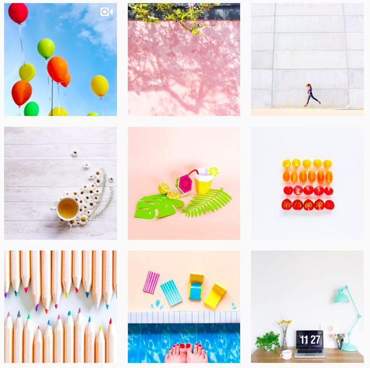
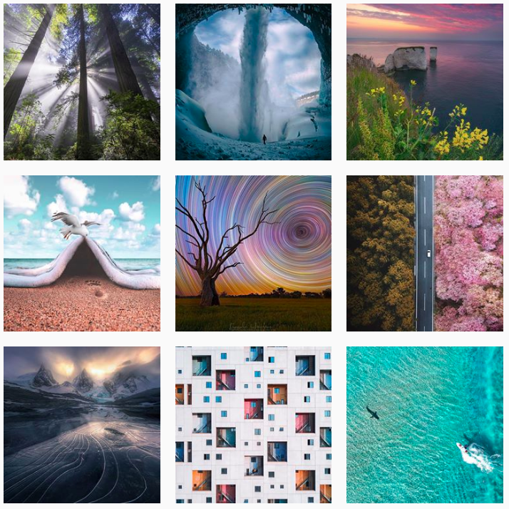
Below are two well achieved examples. In the first, @aurelycerise has chosen a careful array of colorful, minimalist photography, while @designstuff has curated a lovely collection of mildly hued photographs to display their wares.
Photo courtesy of: @aurelycerise
Photo courtesy of @designstuff
@bkstreetart on the other hand takes on a more bold approach with urban art. In all cases the feed is driven by a theme.
Photo courtesy of of @bkstreetart
3) KEEP IT BALANCED
For me this is one of the most crucial and yet most difficult qualities to achieve. It is frustrating to spend time and energy working with a specific image only to notice too late that it has upset the equilibrium in your feed A client of mine introduced me to a wonderful app, Preview, which allows you to plan out your content. I have been using it for several weeks and can't imagine parting with it. EVER. Preview allows me to post life as it unfolds while still maintaining a certain aesthetic.
Here is a look at my feed before and after using the Preview app:
@designsbyalina before using the Preview app.
In the above example, I shot the images with a Sony Alpha 6000 in ideal lighting, however, as a whole the feed feels heavy which detracts from each photo. The jewelry is one-sided which further upsets the balance.
Below is @designsbyalina’s current Instagram feed. Notice how the product photos are carefully juxtaposed as are the minimal with the more extravagant ones. While most shots narrate life as it unfolds, there is no reason not to pull out the oldies but goodies that everyone loves to help drive the lifestyle narrative. That said, if there is an event that might upset the balance in your feed that you must post, by all means do. You can decide whether or not to delete it later.
@designsbyalina after using the preview app.
4) POST ORIGINAL CONTENT
When I first got my feet wet in the instaworld, I reposted a lot because I assumed I needed to show how our designs would look with current trends and styles, so rather than forging ahead with my own aesthetic, I was on an endless quest for content. This approach not only failed to fulfill my own need to create but it also failed to engage my followers because it was neither authentic nor cohesive. Had I listened to my heart and instinct, I would have put to good use the words I always share with my children:
Indeed, if you approach your feed with a passion for design and beauty rather than a race to gain a following, you are more likely to engage than if you drive yourself crazy searching through someone else's content.
EXCEPTIONS
If your profile is designed for the sole purpose of sharing content rather than posting original content, which in turn adds value to both your profile and that of the content owner like these: @wedphotoinspiration, @world_shotz @justgoshoot and @thebest_capture
Photos courtesy of @thebest_capture
If it genuinely ties in with your business and feed. For the most part the Instagram community appreciates originality and authenticity. If you are a brand, that is a must. But if and when someone else's content relates to yours, it makes sense to use it.
In either case, there is a lot of time and money behind content, especially if you are a brand, so please give credit where credit is due. I have had a couple of situations arise with my own images and jewelry that were highly unethical. In one case, an interior designer posted an image as her own. I later realized that this was not an isolated incident as other designers posted comments requesting they be given credit. Similarly one of our necklaces was used for a magazine feature in which only the boutique that carried our jewelry was credited. The magazine had no idea that the necklace was ours and quickly credited us on Instagram and the online version of the feature (for print it was too late). I subsequently dropped the account which misappropriated our jewelry. So the rule of thumb is: if it's not yours, give proper credit. Similarly, when using branded hashtags, you are essentially telling the hashtag creator that you agree to have your content reposted, but that does not eliminate their obligation to credit you.
5) DON'T BE AFRAID TO EXPERIMENT
If like me, you are the sole creator of your Instagram content, building your feed can seem overwhelming at first. Our feed has evolved over time, something that could only be achieved with dedication, trial and error. Play with different filters to create a cohesive unique aesthetic. If you don't like it, delete it. If you want to move in a new direction, "just do it!" But most of all, let your passion and authenticity guide you.
Enjoy the process and result!
Like our feed? Follow us here @designsbyalina
Like what you read? Sign up for our quarterly newsletter covering everything from travel to interior decor to family and design. We send out only four per year, just enough to keep you in the know.
Designs by Alina seeking beauty with passion.


